
Color roles demonstrated in three working contexts
Color changes meaning when it becomes a screen action, a large room surface, or a seasonal material. These examples show why palette roles and proportions matter more than equal swatches.
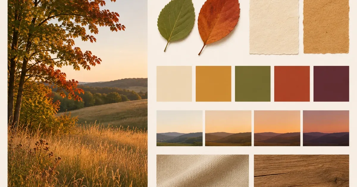
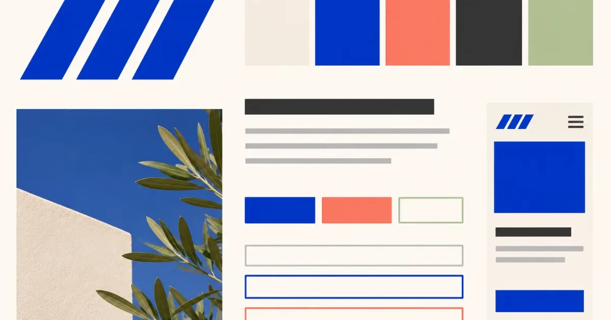
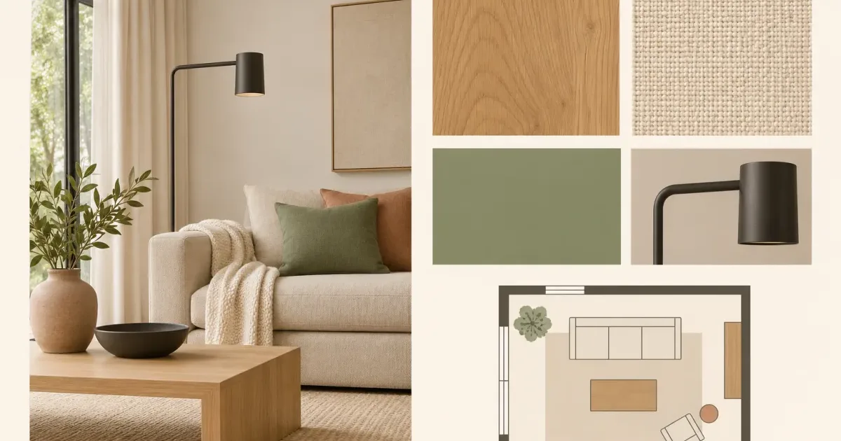
Inspect the gallery for additional proportion and material checks.
Collect color as evidence, not a label
A color name such as blue or earthy is too broad. Collect a large-surface reference, a material sample, an image showing the intended light, and a functional example such as text, trim, control, garment, or flower.
Build three different relationships
Try low contrast for calm background fields, strong contrast for essential reading or action, and a limited accent for orientation. Change area before adding more hues. A small high-chroma detail can dominate even when it appears only once.
Validate the medium
Check text combinations for accessible contrast. For paint, textiles, print, packaging, or products, compare physical samples and production proofs. Screen hex values cannot prove surface texture, sheen, metamerism, ink behavior, or batch variation.
A quiet palette that still communicates
The board uses warm ivory for the largest field, pale sand for surfaces, deep plum for essential text, muted olive for supporting information, and clay red only for emphasis. The same five colors are shown in a room image, paper, textile, and interface test so their jobs remain visible.
Practical checklist for this decision
- Show color area, not only swatches.
- Assign a functional role to every retained color.
- Test essential text and controls for contrast.
- Validate physical and production color outside the board.
Questions about color mood board ideas with practical roles
How many colors should a mood board contain?
Use as many distinct roles as the decision needs and remove colors that do the same job. Five roles are a useful test, not a universal rule.
Can a photograph provide the final palette?
It can provide a starting sample. Compression, surrounding color, screen settings, light, material, and production can all change the result.
Methods connected to color mood board ideas with practical roles
- Practical how to build a mood board color palette
- Practical mood board palette builder
- Practical extract colors from a mood board into functional roles
Find another focused answer
Browse Board design articles related to Color Mood Board Ideas With Practical Roles.